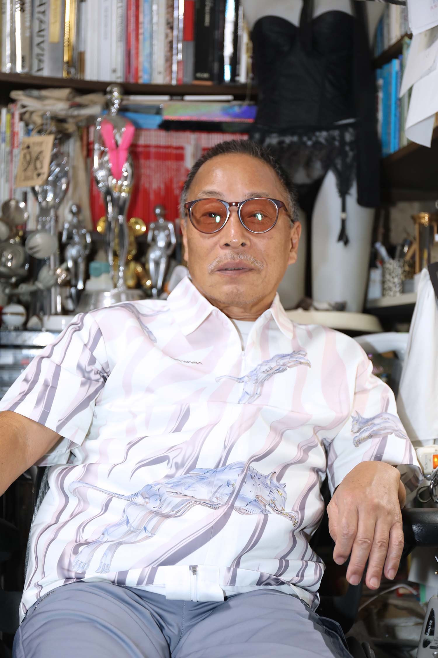
A CONVERSATION WITH HAJIME SORAYAMA


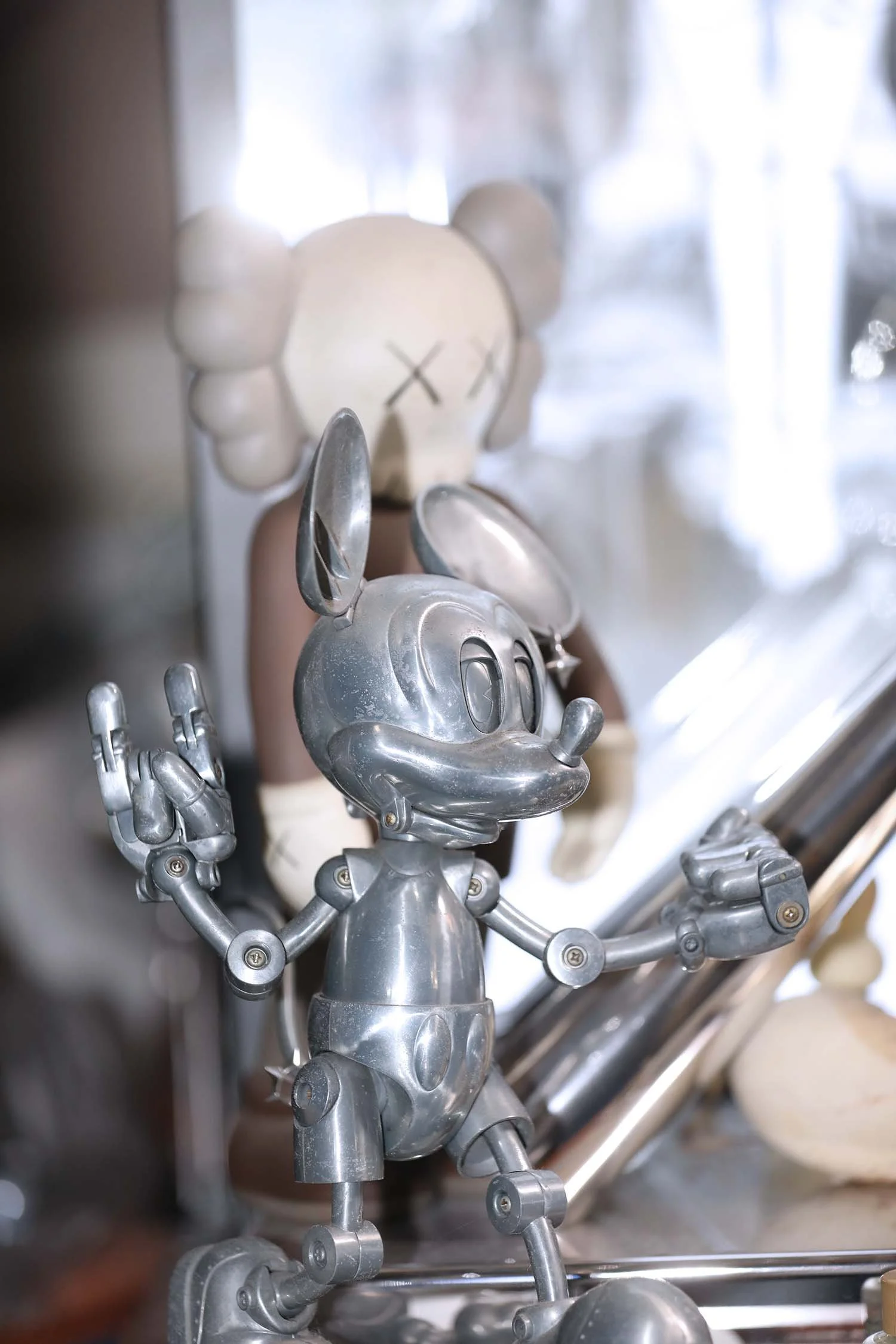
Shiny female robots with their voluptuous curves exposed, striking provocative poses. The Sexy Robot series, born of the technological innovation of late 1970s Tokyo, is the product of an extreme pursuit of taboo and fiction in hyperrealist expression. Its creator, Hajime Sorayama, has so far launched one-of-a-kind projects with creators across genres, from SONY to DIOR and The Weeknd. This autumn, he will release his first collaboration with sportswear brand PUMA, featuring his own newly drawn logo. We interviewed Sorayama in his studio, where he is hard at work on his solo exhibition abroad. We spoke about the origins of taboo expression, the driving force behind Eros, and the project with PUMA.
Your journey as an artist has had many twists and turns?
I wanted to do a lot of different things, but it didn't work out at all. I didn't know what to do in the first place. I wanted to be a pilot for the Self-Defense Force, a sword smith, a temple carpenter, and many other things. I went to a university run by the Southern Presbyterian Church for about a year and a half, but it didn’t interest me. As a reaction to that, I made a pin-up booklet called Pink Journal that made fun of the whole school. When they found out that I was the only one who could draw such beautiful pictures, they got angry and expelled me.
Looking back, people had been complimenting my drawings since primary school, so I thought I'd give it a try. There was a graphic design school in Tokyo where practical skills were not assessed, and that's how I started.
You excelled at drawing from an early age?
As much as any normal child. But I’d draw these twisted pictures, not like a child at all. If I was asked to draw a picture of a sports day, I would draw it using perspective. Some people would praise me, but if it was summer homework, they would say my parents did it, and if it was a contest, they would reject it. I just drew what I saw, I didn't learn from anyone. Even in high school, in an art course, we had a class where we had to complete a painting in four hours, and I thought it was stupid to take that long to do one painting, so I finished it in 15 minutes and spent the rest of the time deliberately goofing off. Then my art teacher told me I had a bad attitude and bad posture, and I got a low grade on my report card. Later, when I had made a name for myself, the art teacher told me to donate my paintings to the school (laughs).


What were you influences during your childhood?
Nothing stands out. I just watched films, listened to music, and read novels. I wasn't really a nerd. I was shallow and broad and didn't limit myself to a single career path. That was a good thing. I was around 22 when I decided to start drawing professionally, so I started late. I had never even done any sketching. My classmates at graphic design school were all people who couldn't draw. I was surprised at first, wondering why they were studying such a thing. I thought that the basic necessity was to draw. I was surprised to learn that there are jobs where you don't need to be an artisan, where you can make a business out of just your sense of style.
Looking back, people had been complimenting my drawings since primary school, so I thought I'd give it a try. There was a graphic design school in Tokyo where practical skills were not assessed, and that's how I started.
Nevertheless, the artisan element, which requires discipline, is at the heart of your work, isn't it?
I think I was suited to it. It's just what happens when you don't work hard, but you do whatever you want. To put it arrogantly, hard work is proof of incompetence. If work aligns with your interests, you can do it without effort. It feels good, it's a dopamine rush. I wonder if it's a talent to find something you love.


Your signature is to draw metal, is it derived from some kind of fetishism?
My father was a carpenter, so he had all the tools to tinker with wood, and my mother sewed, so we had cloth and stuff. There were organic things around, but I was attracted to inorganic things. I had a complex about metal. On the way home from primary school, I used to look at the lathe machines at the ironworks with a silly look on my face, and the old man at the factory used to make me feel uncomfortable. I was even told to go away (laughs). When I think about it now, I wonder if it is fetishism.
From the mid-1960s to the mid-1970s, realism, known as Hyperrealism or Photorealism, was popular all over the world. It was in this context that I was offered a job drawing a car. You had to draw the headlights and wheel caps, thinking logically and rationally about how they would appear in the picture. I drew them repeatedly, thinking about how I could make them better. In the early days, my robots looked like lead and aluminium, but I gradually developed a polished chrome look. Basically, the pursuit of light, reflection and transparency.
I get particularly excited when I create something that didn't exist before. It's hard work. It feels great to be a pioneer, doesn't it? It's a great feeling when you're the first in the world. I don't really want to go home at the end of the day, but I'm too old to overwork my body. I keep the clock in my studio chiming every hour. It feels so good, I can't help it. It's an addiction.
At first glance, it seems that you are pursuing the expression of metal and form, but in fact it is the pursuit of how light interacts with objects.
Yes. Even when I draw faces, I emphasise the eyes, lips, and wet teeth, which reflect the light. For this reason, I hold back on the other elements. The eyes and lips are where the dynamic vision should go. That's why women put makeup there. It's to attract the males. I'm responding to that in a straightforward way. Paint doesn't glow because it's matt. So, in the last five to ten years, I've been using fluorescent colours a lot. I put a little bit of fluorescent colour only in the eyes to make them stand out. The rest of the picture is painted with acrylics. The viewer sees the painting by the movement of the eyes. So, it's a strategy to decide where to put the emphasis.
The basic idea is to surprise or impress. Like if you sleep with a young woman and she says, “I've never done anything like this before!”. That's the most moving thing (laughs). When I'm thinking about obscene and naughty things, my body seems to be able to trick me into using it.

So taboo is used as a means of surprise?
The best way to surprise people is to consciously tinker with all sorts of taboos. In the past, pin-up itself was a taboo, and there was a general brainwashing that pornography is the secret of the lowly. It's essentially a manifestation of physiological desire. You can't deny it because it's good.
There is also a lot of contrast in your pictures, such as the pin-up woman, the Hindenburg explosion, and the Russian military plane, which might be thought of as a play on context.
You're right. I don't give titles to my paintings, so I put text in the picture to make it clearer. Collectors are somewhat educated, so I try to put little tricks in Latin. A while ago, I was painting the goddess Isis, and in the middle of the painting, I put 'Fuck off' in hieroglyphics in the name because it was boring (laughs). Then the easel I was using suddenly broke (laughs). Collectors and followers have become intuitive, and that makes me very happy. I have to be careful though, because taboos are different in Japan and abroad. You can't understand all this unless you experience it in a painful way.

Looking around your studio, you have a lot of materials that connect to death, such as imitation shrunken heads and infant skeletons, also blood-soaked toe-shoes.
There’s also Thanatos (the personification of death in Greek Mythology). I’d explain it like this: a gourmet has to eat bad food to be a gourmet; a non-drinker is better at acting as a drunk. If you don't consciously know the counter, you become attached only to the motif and your expression becomes shallow. However, I've always been interested in that side as well. I draw SM with patterns, but I want to draw the ultimate. The ultimate in reality. I have to stop short of what this kind of expression might possibly be. Otherwise, it becomes a pipe dream.
How do you think the viewer reacts to your paintings?
The medium of painting is a fiction in which three dimensions and space are dropped in a two-dimensional expression. My paintings, for example, can't be real because I use metal to express the softness and fleshiness of subcutaneous fat. I think my realistic fictions are popular because it's the first time for the viewer to experience them. When I go for softness, it feels gentle and warm, even though it's metal. It's a convincing fiction. It's the same with photographic expression - you put fiction in the frame. The underlying idea is to surprise.
How do you feel about the fact that your work with taboos is now regarded as 'fine art'?
When it comes to reputation, it's the art gamblers who are influenced by it. I feel sorry for the artists who are affected by it. I hate the words art and fine art to begin with. I think it's disrespectful to people who are really serious about what they do, when worn-out words are used. I am an entertainer, and it's an entertainment for myself. It's great when the customer is happy and even pays you for it. That's the attitude I've had for 50 years. People who do what they enjoy will survive and their work will live on hundreds of years later. On the other hand, people who pander to the world and make things because they think this kind of thing will be popular are living in bubbles. I believe that the basic principle for an artist is to be interested in their own work. Even if you are asked to do a job, the first thing is to make it interesting, unprecedented and your masterpiece. After that comes the money. Money follows, you know. I don't know why people put money first.


In this collaboration with PUMA, I heard you have tried something new.
I have collaborated with various apparel companies, but PUMA is the first where I have drawn the characters and logo. With the PUMA cat, I wanted to express a sense of dynamism, so I drew it from a different angle. I wanted to create a sense of speed, so I changed the direction and proportion of the tail in my own way. I also made original logos for SORAYAMA and PUMA. I didn't want to just hand over my artwork and leave it to them, I wanted to make something practical that we could take pride in, since we were releasing it to the world.
That's a higher level of commitment.
Once I'm commissioned, I take it all seriously. It's a globally influential brand. When you're doing this at my age, you don't want to just go through the motions. Even if I die, I still want to compete. This reluctance to give up fuels creativity. I did a lot of checking before we released it, and it's rare that I've put so much time and effort into giving feedback. PUMA staff are very patient. I'm a person who will try to fix it forever, so it's cruel to get others involved. But I think that's why the quality of the products is excellent.
Adapting from two-dimensional to three-dimensional expression must have been difficult. What areas were you particular about?
It’s completely different from a painting. When you wear clothes, the back is also in play. I didn’t only work on the front of the clothes, but also on the back, fine-tuning colours and patterns. Rather than reproducing the picture, it was more about how to create an effect with the material. I also made requests to enhance the effect when the garment is worn. For example, I asked the designers to study Japanese Sukajan (retro Japanese bomber jackets) from scratch. We devised a way to make the fabric shine when the light reflects off it, making the pattern look three-dimensional. This is a challenge unique to apparel. When the medium changes new discoveries are made.
Do you have a favourite piece of those you created for PUMA?
It's the CLYDE, synonymous with PUMA sneakers. I gave them the task of being the go-to trainer on a date. They're made of shiny gold and silver metallic materials inspired by my artwork. I also used enamel on the toe. I was also very particular about the colour, and I had them changed to bluish gold. In the end, I wanted to make what I want to wear. I decided on a dragon as the main visual for the collection (to be released next year). I drew it from the archive and added to it. You can see my painstaking way of drawing it, I even draw the scales one by one. I'm looking forward to seeing that become an item.
What role does technology play in your creations?
Digital reproduction has changed a lot. For paintings, after reproducing the original, I use 12-colour giclee prints. Because they are dyes, there is a pleasant feeling of colour that only colour prints can produce. It's a colour you can't get with paints. I add fluorescent colours and paints to the prints, and it's a hybrid of digital and handcraft, a combination of the advantages of each. In the so-called art market, prints are said to be less valuable, but in essence they are much better. I'm also experimenting with sculptures and am working on a flying pose for the first time. I'm working with a craftsman on how to make it float in the air, and how to make the hair move with the metal to make it more dynamic. Thanks to technology, we can challenge ourselves to create new expressions. Apparel is no different. It's boring to do the same thing over and over again. I have to come up with different techniques each time. There is no end to creativity.

